
WhenLoveWorks
Client Work | Responsive Web
WhenLoveWorks is an an online coaching platform dedicated to disrupting the status quo of unhealthy relationships of all kinds. WhenLoveWorks encourages clients to go within and self-reflect, removing obstacles, and engaging in transformative work that enables them to thrive at optimal levels in personal, romantic, and professional relationships.
Timeline
3 Weeks
My Role
UX / UI Designer
UX Team
Susan Choi
Molly W. Stewart
Dominik Rawle
Carl A. Vital
Challenge
WhenLoveWorks approached our UX Team to re-design their website in order to give value to who they are and to give clarity to the meaningful services they provide for their current and new users.
Tools
Sketch | Invision | Zeplin | Craft | Trello | Keynote
Methods
Agile | Sprints | Scrum | Screener Surveys | User Interviews | Affinity Mapping | User Persona | Journey Mapping | User Flow | Task Flow | Heuristic Analysis | Competitive & Comparative Analysis | Rapid Prototyping | Wireframes | Usability Testing | Iterative design & Testing | Specification Document | Style Guide | Storytelling | Presentation
Discover
Market
Research
Before diving into our research, we explored the market in order to understand what the competitors were doing differently. We were able to conduct a competitive analysis of the different competitors' websites along with a heuristic analysis for both our Client and the competitors to find the areas of improvement for the site and for the users.

Relationship Hero
Relationship Hero helps people overcome their relationship challenges successfully. There is an instant access to a team of professional coaches who specialize in areas where the users need help, and provide actionable advice that's personalized to their situation. They are available 24/7 for ongoing support along the user's journey.
Highlights
Primary Navigation | Onboarding | Testimonials | Organized Content | Call to Action
Talkspace
With Talkspace users don't have to wait for appointments and can send their therapist a message whenever they're near a laptop, tablet, or smartphone. Conversations can carry over seamlessly across devices and uses banking-grade encryption to keep it safe and confidential.
Highlights
Primary Navigation | Onboarding | Testimonials | Organized Content | Call to Action | Personalization

Through our heuristic analysis and competitor analysis we were able to discover 3 main areas of improvement for the WhenLoveWorks website:
IMPROVE
FINDABILITY
ALIGN
VALUE & MESSAGE
IMPROVE
UNDERSTANDING
Key User Insights
We were able to get in contact with 10 users after our heuristic analysis to start user interviews. After the interview process, our team gathered insights from affinity mapping and started to analyze and find trends that emerged from the data we collected.
From the data, we were able to find the key insights that would help us to ideate and create design solutions for our users. We were then able to personify our users and find their pain points, needs, and goals.
Needs to easily find and understand the information on the services that are provided.
Wants a supportive and transparent community for accountability.
Needs guidance to help better themselves.
Wants to stay connected with communities through events.
Define

How might we help Kai find the guidance and tools he needs to better navigate his personal life, and take action toward the healthy relationship dynamics he deserves?
Develop
Research to Design
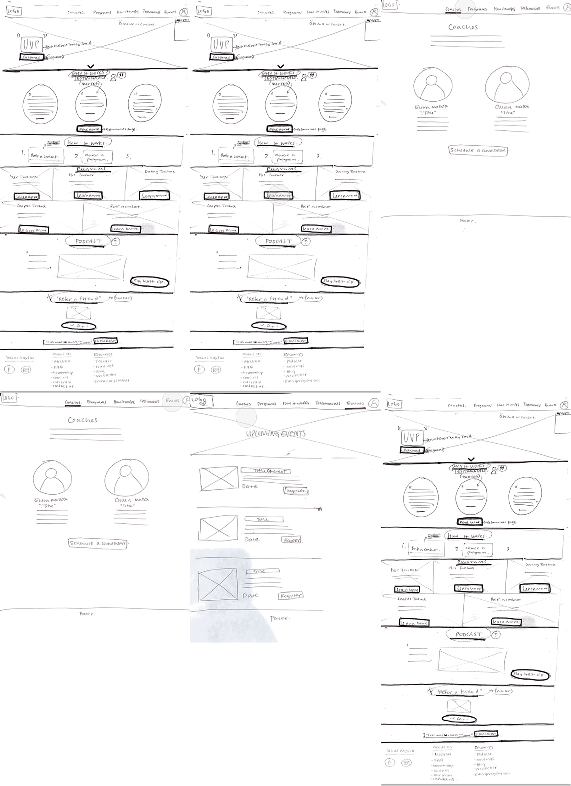
In order to improve findability, understanding, and help align the value and message of the website we went through paper prototyping, mid-fidelity wireframe design, mid-fi usability testing, hi-fidelity design mockup, and hi-fi usability testing.
Based on our insights and data, we saw that users needed a clear primary navigation feature where they could easily navigate the website and find what they are looking for. Our secondary feature was was to improve the website's messaging content so that the value of the workshops & sessions could be emphasized throughout the website.
Paper Prototypes

Mid-Fi Wireframes

Hi-Fi Mockups

Clear Primary Navigation
As we conducted a series of usability testing for all parts of our prototype phases, we saw that users were able to easily complete their tasks as our team continued to make improvements on the primary navigation, which was our main feature.
The new top primary navigation would help Kai easily find the guidance and tools that he needs to help better himself.


Message & Value
Kai needs to easily find and understand the services that are being provided for him. In order to help him find value in the services he finds, our team improved the messaging of the content on the website, specifically for the workshops and sessions.
When Kai clicks on the workshop & sessions page from the primary navigation, it takes him to a page that provides information about the help he needs.
Quotes from users
"I like the simple, clean layout.”
Users found that the site was simple and organized with content and navigation.
"Everything is easy to understand and find."
100% of users rated 5/5 in terms of ease of use, navigation, and messaging.
"The images are warm & friendly - it feels more personal.”
Users found the layout of the site to be safe and friendly for them to continue finding a coaching workshop/ session.
Deliver

Next Steps
Short-Term
-
Create new registration & payment portals for services.
-
Integrate “My Account” login for returning users.
-
Review naming conventions for services (“His/Hers, & “Toolbox”).
-
Develop and strategize additional content for the website.
-
Finalize responsive mobile app designs.
Long-Term
-
Continue research & design for future development of a WLW app.
-
Research the market for Professional Development opportunities.